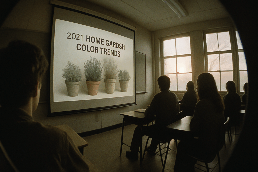
Why Color Choices Are More Intentional Than Ever
In 2024, vloggers are thinking harder about the colors they use on camera. It’s no longer just about looking good. It’s about making people feel something. Whether it’s soft earth tones for calm or bold reds for energy, every color is doing a job.
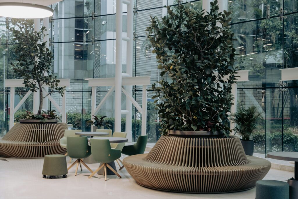
Creators are tuning into how their spaces affect their moods, and by extension, their audiences. Shooting in a cluttered room with harsh lights doesn’t just look bad. It makes people tune out. The rise of mood-aware styling—muted palettes, natural textures, plant life—isn’t a trend; it’s a mindset. Vloggers are curating their environments the same way they curate their stories.
There’s also a bigger picture here. As more people lean into conscious living, visual choices are reflecting that shift. More minimalism, more reuse, more honesty. Viewers can feel when a space is authentic—and they’re responding to the quiet power of that intention.
Color Trends: Darker Tones, Simpler Updates
Shifting Away from Bright Whites
Crisp, bright white exteriors are starting to fall out of favor. In their place, we’re seeing the rise of richer, more grounded hues that reflect a desire for warmth, subtlety, and timeless appeal.
- White tones are becoming less dominant due to maintenance demands and harsh contrast
- Homeowners are gravitating toward colors that blend into natural landscapes
- New palettes support a more sophisticated curb appeal
Rise of Muted and Modern Hues
Expect to see a surge in the use of deep, moody colors that bring character without overwhelming simplicity.
Popular tones for 2024 include:
- Charcoal: sleek, modern, and low-maintenance
- Dark green: earthy, classic, and highly versatile
- Slate: neutral yet bold, perfect for minimal exterior design
These tones don’t just elevate the main body of a home—they pair well with both matte and textured finishes.
Small Changes with Big Impact
For those not ready to repaint their entire exterior, smaller updates can make a noticeable difference. Adding depth and contrast through accent features is both cost-effective and visually impactful.
Try refinishing these areas for maximum effect:
- Fences: a dark coat can create clean garden borders or privacy zones
- Shutters: accentuate architectural features without overwhelming them
- Front doors: a bold, deep color can modernize your entryway instantly
These more refined and muted tones offer a modern upgrade that doesn’t demand a full overhaul. Whether you’re going big or starting small, the shift toward deeper colors is a trend worth embracing.
Mood-Driven Garden Design: Flowers, Foliage, and Functional Beauty
Garden design in 2024 continues to blend aesthetic appeal with emotional intention. Homeowners and designers are using color therapy and cohesive styling to transform outdoor spaces into mood-enhancing environments. Here’s how to approach modern flower beds and container gardens with strategy and style.
Flower Beds for Every Mood
The color of your flowers can impact the mood of your home’s exterior. Whether you want to create a serene sanctuary or an inviting burst of energy, thoughtful palette choices help set the tone.
Calming Blues and Purples:
- Lavender, salvia, and blue delphinium encourage relaxation
- Ideal for spaces intended for reading, meditation, or unwinding
- Pair with soft white or silver foliage for extra elegance
Energizing Yellows and Oranges:
- Marigolds, zinnias, and rudbeckia add vibrance and warmth
- Perfect for front yards that aim to feel welcoming and cheerful
- Best used near entrances or entertainment areas for lively curb appeal
Modern Foliage Combos That Elevate Curb Appeal
Foliage plants add depth, texture, and structure to your garden. Combining plants with contrasting shapes and hues creates a balanced yet eye-catching look.
Popular shades and forms include:
- Dark-leafed cannas or coleus next to variegated hostas
- Tall, architectural grasses beside low-growing creeping jenny
- Silvery foliage like dusty miller for a modern, cool-toned base
When selecting foliage, mix height, leaf size, and tone for the most dynamic results.
Coordinated Container Gardens
Container gardening is ideal for small spaces or for adding highlights in specific zones. Modern homeowners are also paying attention to how planters and pots complement the rest of their outdoor decor.
Design with cohesion in mind:
- Match pot colors to existing outdoor furniture or wall paint
- Use geometric or matte-finished containers for a minimalist look
- Blend plant heights and colors within the same pot for layered interest
Pro Tip: Repetition is key. Using the same color planters or repeating certain plants across a patio or pathway creates a unified and cohesive outdoor space.
With the right balance of color, foliage, and coordinated details, you can craft a garden that doesn’t just look good—but feels just right too.
Earthy Neutrals: This year, sand, clay, and mushroom hues are doing heavy lifting across interiors. These tones are subtle but solid—strong enough to warm up a wall, soft enough to let other pieces speak too. Furniture is catching up fast, favoring natural textures and warm undertones that make rooms feel grounded.
Rich Greens: Sage, olive, and forest tones are all in rotation. These colors bring in that outside-in calm. Whether it’s cabinetry, accent chairs, or just a painted trim, green is proving it can carry almost any space when paired with the right light and materials.
Bold Accents: Terracotta, deep blue, and mustard are landing in focused doses. Think throw pillows, tiling, or a single dramatic wall. These shades add depth and keep neutrals from going stale. It’s not about overload. One or two bold hits are enough to shift an entire room’s energy.
Lighting Matters: All these tones read differently depending on lighting. Natural light brings out dimension in earth tones and greens. Warm LEDs soften deeper hues, while cool lighting can flatten or clash with warmer palettes. As always, test before you commit. Paint chips in daylight won’t behave the same at night.
Color in a landscape isn’t just about flowers or fall leaves. The hard stuff matters—the house exterior, stone paths, fences, even the gravel. These elements set the tone year-round, so getting their color right is step one. A warm-toned patio or a cool gray retaining wall becomes the anchor for everything else. Once that’s locked in, seasonal planting palettes do the heavy lifting with variety and contrast.
Plants bring the rhythm. Spring blooms, summer greens, autumn textures, winter structure—they shift and evolve. The trick is to choose plant colors that complement rather than fight the permanent features. For example, orange tulips hit harder against charcoal pavers, while silver-foliaged plants cool down a red brick facade.
The balance comes from playing both ends. Landscaping isn’t just soft, and architecture isn’t just static. The best spaces blend the two, using color as quiet glue. Subtle tones in one area let the other side shine. When done right, your space feels intentional even in the off-season.
Before you splash a color across an entire wall or buy six yards of bold fabric, take a pause. Swatches exist for a reason. Test paint samples in a few spots on different walls, not just one. Let them sit for a day or two. Light shifts throughout the day can make a warm beige look flat or a moody blue feel cramped. Same goes for fabric—tack it up near furniture or lay it on floors to see how it plays with your textures and lighting.
Color isn’t just style, it’s space management. Want to make a small room feel bigger? Stick to lighter tones that reflect natural light. Cooler shades tend to retreat, making walls feel farther away. On the flip side, if you’re working with a large outdoor deck that lacks intimacy, warmer, darker hues can help pull things in visually and make the space feel cozier.
The smartest color choices often come from what’s already around you. Look at how sunlight moves through your space. Notice tones in the wood, stone, or even the dominant hues outside your windows. When you build off your environment, colors feel grounded instead of just trendy. Trends cycle fast—harmony sticks.
Colors aren’t just aesthetic choices anymore—they’re signals. In 2025, they’re aligning with deeper design themes: stability, sustainability, and personalization. Earth tones aren’t fading either. In fact, they’re evolving. Mossy greens and warm chalky browns are showing up in everything from accent walls to planters, syncing with the rise of biophilic interiors. But there’s a curveball too. Unexpected saturated pairings—like bold ultramarine next to raw wood—are cropping up in both modern gardens and minimalist kitchens.
What’s behind it? People want spaces that reflect personal values while still feeling timeless. It’s less about following color-of-the-year hype and more about layering tones that ground the senses. For a breakdown of how these shifts play out across spaces and styles, check out the broader design patterns in Top Home and Garden Trends to Watch in 2025.
Color isn’t just something you see. It’s something you live with. The right shades can calm you down, wake you up, or make a room feel like a true extension of who you are. It’s not about chasing trends or matching the latest influencer’s wall paint. It’s about building a vibe that actually fits how you move through your space day to day.
That’s why smart creators—and homeowners—are getting more intentional. They’re ditching loud palettes that wear out their welcome in a season and leaning into tones that align with their energy, habits, and needs. Think cozy neutrals for homes that double as workspaces. Cool blues and greens for people craving calm. Even unexpected combos that challenge the norm but just feel right.
So next time you’re picking colors, don’t just match your throw pillows. Ask yourself how you want to feel in that space. Let the answers guide you instead of the algorithm.
 Ask Susana Foleyesters how they got into outdoor living tips and you'll probably get a longer answer than you expected. The short version: Susana started doing it, got genuinely hooked, and at some point realized they had accumulated enough hard-won knowledge that it would be a waste not to share it. So they started writing.
What makes Susana worth reading is that they skips the obvious stuff. Nobody needs another surface-level take on Outdoor Living Tips, DIY Home Projects, Home and Garden Trends. What readers actually want is the nuance — the part that only becomes clear after you've made a few mistakes and figured out why. That's the territory Susana operates in. The writing is direct, occasionally blunt, and always built around what's actually true rather than what sounds good in an article. They has little patience for filler, which means they's pieces tend to be denser with real information than the average post on the same subject.
Susana doesn't write to impress anyone. They writes because they has things to say that they genuinely thinks people should hear. That motivation — basic as it sounds — produces something noticeably different from content written for clicks or word count. Readers pick up on it. The comments on Susana's work tend to reflect that.
Ask Susana Foleyesters how they got into outdoor living tips and you'll probably get a longer answer than you expected. The short version: Susana started doing it, got genuinely hooked, and at some point realized they had accumulated enough hard-won knowledge that it would be a waste not to share it. So they started writing.
What makes Susana worth reading is that they skips the obvious stuff. Nobody needs another surface-level take on Outdoor Living Tips, DIY Home Projects, Home and Garden Trends. What readers actually want is the nuance — the part that only becomes clear after you've made a few mistakes and figured out why. That's the territory Susana operates in. The writing is direct, occasionally blunt, and always built around what's actually true rather than what sounds good in an article. They has little patience for filler, which means they's pieces tend to be denser with real information than the average post on the same subject.
Susana doesn't write to impress anyone. They writes because they has things to say that they genuinely thinks people should hear. That motivation — basic as it sounds — produces something noticeably different from content written for clicks or word count. Readers pick up on it. The comments on Susana's work tend to reflect that.