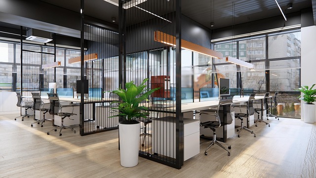
Why a Consistent Color Palette Matters
Creating a cohesive and visually pleasing space goes beyond just furniture placement or styling. One of the most powerful tools in interior design is a consistent color palette. Here’s why it matters:
Visual Harmony and Flow
Using a unified set of colors across a space helps create visual flow. Rather than rooms feeling like separate, disconnected areas, a consistent palette ties everything together. This sense of unity makes your entire home feel thoughtfully designed.
- Seamless transitions from room to room
- Enhances balance across different design elements
- Makes spaces feel larger and more connected
Simplifies Decision-Making
When decorating, too many choices can quickly become overwhelming. A consistent color palette acts as a built-in filter during your design process.
- Limits options, reducing decision fatigue
- Speeds up shopping for décor and furniture
- Ensures new pieces fit into the overall look
Adds Intentionality to Eclectic Styles
Even if your design style is eclectic, sticking to a color palette can make the mix feel purposeful rather than chaotic.
- Blends diverse styles without visual clutter
- Helps highlight unique pieces without distraction
- Creates a cohesive, curated look
A consistent color palette is a simple but impactful way to elevate your space. Whether your style is modern, vintage, or somewhere in between, color continuity adds polish and intentionality.
How to Structure Your Color Palette for Stronger Brand Identity
Creating a visually cohesive and memorable brand starts with a well-structured color palette. Whether you’re designing your YouTube channel, personal logo, or thumbnail style, getting your palette right can instantly improve your content’s professionalism and recognizability.
The 3-Part Palette Formula
Most successful creators use a three-tier system when building their palette:
- Dominant Color: This is your brand’s signature shade. It should appear most frequently and define the overall energy of your visuals.
- Secondary Color: This complements the dominant color. You’ll use it to introduce contrast and keep layouts visually interesting.
- Accent Color: The pop. This is the smallest part of your palette, used to draw attention to key elements like call-to-action buttons, clickable areas, or text highlights.
Why This Formula Works
This simplified structure keeps your visuals clean and intentional. Using too many colors can make content feel cluttered or inconsistent, but this method ensures:
- Visual hierarchy is clear
- Key elements stand out without overwhelming the viewer
- Branding feels familiar and instantly recognizable across platforms
Real-Life Examples
Let’s look at how some creators apply this structure:
- Tech Vlogger Example: Dominant (Midnight Blue), Secondary (Light Gray), Accent (Electric Blue). This combination gives a modern feel while keeping the viewer’s focus on links and important info.
- Lifestyle Creator Example: Dominant (Soft Beige), Secondary (Muted Pink), Accent (Gold). The result is a warm, inviting aesthetic that speaks directly to the creator’s target audience.
- Gaming Channel Example: Dominant (Charcoal Black), Secondary (Crimson Red), Accent (Neon Green). A bold mix that matches the intensity of the content.
Final Tip
Stick to your palette consistently across thumbnails, intros, overlays, and profile branding. This builds visual trust and helps current and new viewers associate your content with your unique style.
Choosing the Right Color Palette
Start with what you already love. The colors you’re drawn to in clothes, artwork, or even coffee mugs are telling. If you always pick blue over red or lean toward earth tones, that’s a clue worth following.
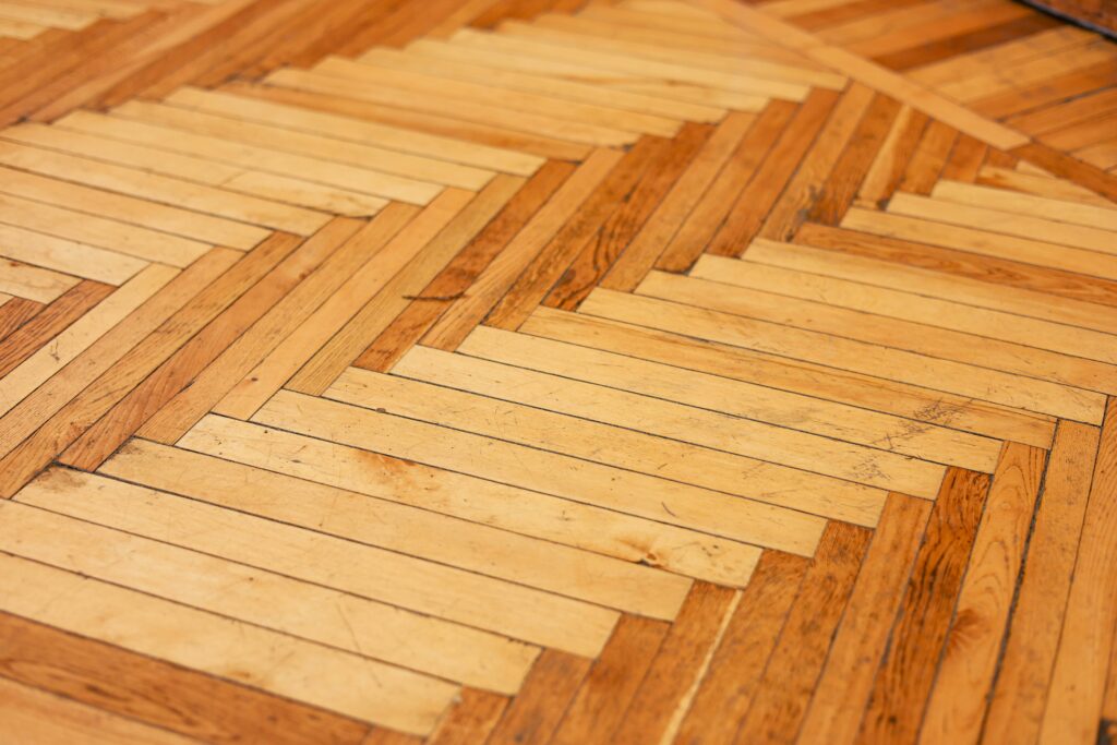
Look around your space. Pull cues from things that already speak your style, like a vintage rug, a favorite poster, or the grain of your wooden dresser. Those existing elements can anchor your palette and keep the look cohesive.
Before going all in, test it out. Swatches, sample boards, and digital preview tools can help you see what works without regret. Sometimes the color that looked great on a Pinterest board feels off in real life. Small tests help you catch that before it becomes expensive.
This isn’t about rules. It’s about making intentional choices rooted in your real taste and space.
Open spaces offer flexibility, but that doesn’t mean everything has to blur together. The trick is creating visual variety without turning your room into a patchwork. Color zoning is a solid go-to. Use deep tones to anchor lounge areas, light neutrals for workspace zones, and warm hues for dining spots. It sets intention without putting up walls.
Don’t shy away from saturation or texture either. A navy accent chair, a rust-toned rug, or even a bright mossy green plant can give a space a shot of life. Play with velvets against concrete, matte paint with glossy tile. These contrasts add depth fast.
And neutrals? They’re fine. But too much beige makes a space feel like a waiting room. Use layered tones—greige, taupe, ivory—and loop in texture to break it up. Think boucle cushions, woven baskets, or a matte clay vase. Cohesion comes from keeping a few elements consistent: material finishes, color temperature, or silhouette styles.
Aim for calm, not monotony. A well-zoned, textured space respects both comfort and character.
When it comes to vlogging environments or even just setting up your home filming space, color flow between rooms matters more than people think. One of the biggest hang-ups? Jarring color shifts. If your living room is a soft gray and your workspace is a bold emerald green, crossing between the two on camera can feel like a hard cut—especially as natural light shifts.
A simple way to handle it: pick undertones that play nice together. Don’t think in terms of just wall colors. Look at your trim, door color, and flooring. These can act as visual bridges. A warm wood tone in both rooms can help different hues feel more connected. Painting interior doors and trim the same neutral across rooms works too—it’s like stitching different pieces of a visual story together.
Your eyes are sensitive to edges and shifts. A sudden saturation jump reads as chaotic. But gradual transitions trick the eye into thinking the look is cohesive. If you’re moving between rooms often on camera, this kind of color planning means your transitions feel intentional—not distracting.
Color is doing more heavy lifting than ever in vlogging setups. It’s not just visual flair — it’s visual strategy. A warm earth-tone palette sets the mood for creators aiming for comfort and coziness. Think terracottas, muted golds, soft browns. That combo works well with traditional or cottage-core interiors and invites viewers into a slower, more grounded pace.
On the flip side, modern monochromatic schemes built around neutrals with black accents are dominating tech, fashion, and lifestyle vlogs. The minimal contrast keeps the focus on the creator. It’s all sharp lines and controlled tone — clean but not cold.
Then you’ve got soft pastels dropped into deeper, moody backgrounds. Lavender against navy, mint alongside espresso tones. It’s an aesthetic that lets lighter colors pop while grounded hues stabilize the energy.
Each palette isn’t just about looking good. It shapes perception. It anchors your brand. And it plays better with specific furniture choices — vintage wood for earth tones, matte metals for monochrome, plush textures for the pastel combo. Choose your colors like you choose your message: with intention.
Color theory is finally getting the attention it deserves in vlogging setups. The smart use of undertones—warm vs. cool, muted vs. saturated—is helping creators avoid clashing palettes without going full monotone. It’s less about matching and more about harmony. When your background, wardrobe, and graphics share an undertone family, your content looks polished without trying too hard.
Now there’s also more experimentation with finishes. Mixing matte and gloss can create a subtle, dynamic look that holds visual interest. Matte walls offset by glossy props. Textured fabrics next to smooth tech. These combinations keep the frame from going flat, especially in static environments.
Contrast is still key, but it’s getting more purposeful. Instead of harsh neon on beige, creators are using deliberate contrast to highlight focal points and establish hierarchy. Light on dark, soft on sharp, rich alongside neutral—it’s all about guiding the viewer’s eye without overwhelming them. The result? A setup that feels elevated but never overproduced.
Interior Design Mistakes Vloggers Should Avoid
Creating a visually appealing filming space is more than just picking a few trendy items and hitting record. A well-thought-out background can enhance your personal brand, keep viewers engaged, and make your videos more watchable. But getting it wrong can be distracting—or worse, drive viewers away. Here are three common design slip-ups vloggers should avoid:
Over-relying on Trendy Colors
Staying current with color trends might seem like a good idea, but it can backfire if your space starts to feel dated too quickly.
- Trendy colors come and go. What looks stylish this year may feel out of place next year.
- Instead of designing your whole space around the color of the moment, opt for a more neutral base. Add pops of popular shades through accents that are easy to swap out.
- Safe strategy: stick to timeless walls and furniture, and bring trends in through pillows, wall art, or desk accessories.
Ignoring Natural Light
Lighting is everything on camera, and natural light can be a powerful (and free) asset if used correctly.
- Filming in dark corners or rooms without windows can make your videos look flat or grainy.
- Make the most of daylight by positioning your filming setup near a window with diffused sunlight.
- Avoid harsh direct sunlight, which can wash you out or cast distracting shadows.
Forgetting About Ceilings and Trim
Viewers may not notice when a setting works—but they’ll often sense when something feels off. Overlooking ceiling and trim details can break the visual cohesion of your space.
- Dirty ceiling paint, mismatched molding colors, or outdated trim styles can subtly distract or reduce the overall professionalism of your videos.
- A clean, consistent finish on ceilings and trim can quietly elevate your aesthetic.
- Consider repainting or updating moldings for a more polished on-screen presence.
Keep in Mind: Great design doesn’t just serve aesthetics—it supports focus and clarity. When your background is clean and thoughtful, your content stands out.
Color is the common language that helps vintage and modern styles work together instead of clash. On the vintage end, you’re often looking at muted tones—mustard yellows, forest greens, faded rose. These colors have weight, history, and texture. Meanwhile, modern palettes lean clean and controlled—think stark whites, charcoals, or cool blues.
The trick is balance. A vintage mid-century chair in worn leather looks sharp against a backdrop of clean, neutral walls. Or take a modern metal coffee table—its sharp edges get softened when paired with earthy olive cushions or rust-toned throws. It’s about contrast that speaks, not conflict that yells.
Color lets you nod at nostalgia while keeping the space feeling current. It’s less about rigid rules, more about eye and instinct. Smart pairings of complementary tones can make the room feel layered instead of confused.
For more ideas on mixing eras through design, check out The Return of Vintage: Mixing Old and New in Interiors.
Keep your edits simple. Intentional doesn’t have to mean overdesigned. A cleaner layout, better lighting, or smoother transitions can go a long way without feeling forced. Vlogs breathe better when you don’t clutter their story.
As your life shifts, let your content shift too. A move to a new city? A big career pivot? Revisit what your space (digital and physical) says and tweak things to reflect the now. Your audience connects with your evolution, not a static version of you.
Consistency matters, but it doesn’t mean repetition. You can build a recognizable brand without becoming predictable. Color is a great place to start. Use bold hues or muted palettes that reflect your energy—whatever feels like you. Let small, deliberate choices show your personality in every frame.
 Ask Susana Foleyesters how they got into outdoor living tips and you'll probably get a longer answer than you expected. The short version: Susana started doing it, got genuinely hooked, and at some point realized they had accumulated enough hard-won knowledge that it would be a waste not to share it. So they started writing.
What makes Susana worth reading is that they skips the obvious stuff. Nobody needs another surface-level take on Outdoor Living Tips, DIY Home Projects, Home and Garden Trends. What readers actually want is the nuance — the part that only becomes clear after you've made a few mistakes and figured out why. That's the territory Susana operates in. The writing is direct, occasionally blunt, and always built around what's actually true rather than what sounds good in an article. They has little patience for filler, which means they's pieces tend to be denser with real information than the average post on the same subject.
Susana doesn't write to impress anyone. They writes because they has things to say that they genuinely thinks people should hear. That motivation — basic as it sounds — produces something noticeably different from content written for clicks or word count. Readers pick up on it. The comments on Susana's work tend to reflect that.
Ask Susana Foleyesters how they got into outdoor living tips and you'll probably get a longer answer than you expected. The short version: Susana started doing it, got genuinely hooked, and at some point realized they had accumulated enough hard-won knowledge that it would be a waste not to share it. So they started writing.
What makes Susana worth reading is that they skips the obvious stuff. Nobody needs another surface-level take on Outdoor Living Tips, DIY Home Projects, Home and Garden Trends. What readers actually want is the nuance — the part that only becomes clear after you've made a few mistakes and figured out why. That's the territory Susana operates in. The writing is direct, occasionally blunt, and always built around what's actually true rather than what sounds good in an article. They has little patience for filler, which means they's pieces tend to be denser with real information than the average post on the same subject.
Susana doesn't write to impress anyone. They writes because they has things to say that they genuinely thinks people should hear. That motivation — basic as it sounds — produces something noticeably different from content written for clicks or word count. Readers pick up on it. The comments on Susana's work tend to reflect that.