I’ve decorated enough grand spaces to know that mint can go wrong fast.
You’re probably staring at those mint walls wondering how to make them feel like a palace instead of a nursery. The color is beautiful but tricky. Get it wrong and your space looks cheap or cold.
Here’s the thing: mint needs the right partners. The wrong metals, the wrong textures, and suddenly your palace feels like a beach house.
I’ve spent years working with large spaces and color palettes that demand sophistication. Mint is one of those colors that separates amateurs from people who understand how materials and light actually work together.
This guide shows you how to turn your mint palace into something regal. I’ll walk you through which colors to pair with mint, what materials elevate it, and how to arrange your space so it feels grand instead of gimmicky.
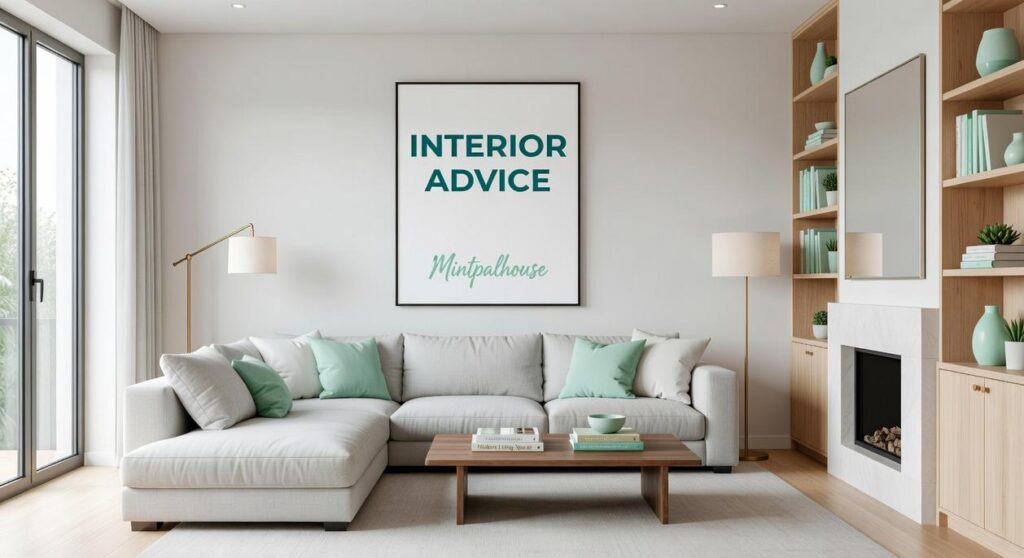
At interior advice mintpalhouse, we focus on practical design strategies that work in real homes. Not theory. Not trends that disappear in six months.
You’ll learn how to choose metals that complement mint without clashing, which textures add depth, and how to balance that delicate color with pieces that command attention.
No fluff about finding your personal style. Just the specific choices that make mint look expensive.
Mastering the Mint Palette: Complementary & Accent Colors
Here’s what most people get wrong about mint.
They paint everything mint and call it a day. Walls, trim, maybe even the ceiling if they’re feeling bold.
Then they step back and wonder why the room feels flat.
I see this all the time. Someone falls in love with mint (and who can blame them) but forgets that even the prettiest color needs support. A room that’s all one shade just sits there. No depth. No interest.
The truth is, mint works best when you treat it like the star of the show, not the entire cast.
You need supporting colors. Ones that bring out mint’s cool freshness while adding warmth or drama where it counts. That’s where a layered palette comes in.
Let me walk you through three approaches that actually work in real spaces.
Gilded Cream & Gold
This is my go-to when someone wants their mint room to feel warm and a little fancy.
Start with soft cream on your trim and ceiling. It keeps things light but adds just enough warmth to balance mint’s cool undertones. The cream also makes the mint feel more intentional, like you planned the whole thing (which you did).
Then bring in gold. Not everywhere, just in the right spots.
Think gilded mirrors above a console table. Picture frames with thin gold leaf edges. Cabinet hardware that catches the light. These touches add warmth without fighting the mint for attention.
The result? A space that feels neoclassical but not stuffy. You get that interior advice mintpalhouse readers ask about: how to make mint feel grown up.
Dusty Rose & Polished Brass
Now, if you want something a bit more romantic, this palette delivers.
Pair your mint walls with dusty rose accents. I’m talking muted pinks, not bubblegum. Rose-toned throw pillows, a vintage chair reupholstered in blush velvet, or even rose-patterned curtains if you’re feeling brave.
The pink adds depth. It creates contrast without clashing, and it pulls out any warm notes hiding in your mint.
For the metallic, go with polished brass. It’s warmer than gold but still has that contemporary edge. Brass lamp bases, drawer pulls, or a modern brass pendant light all work.
This combination feels current but soft. Perfect if you want your space to feel welcoming without looking too traditional.
Charcoal & Silver
Sometimes you need drama.
That’s where charcoal comes in. Use it on an accent wall behind your bed or sofa. Or paint built-in shelving a deep charcoal to create a focal point that grounds all that airy mint.
The dark color stops the room from floating away. It gives your eye somewhere to land.
Then add silver and chrome for shine. A silver-framed mirror. Chrome light fixtures. Even stainless steel picture frames if that’s your thing.
The reflective surfaces bounce light around and keep the charcoal from feeling heavy. You end up with something that nods to art deco but still feels fresh.
The key with any of these palettes? Don’t overthink the ratios. Let mint dominate, use your secondary color for medium-sized accents, and sprinkle in metallics where they make sense. In the vibrant world of game design, achieving the perfect balance in color palettes is crucial, and with Mintpalhouse as your inspiration, let the refreshing mint take center stage while allowing your secondary hues and metallics to enhance the overall aesthetic without overshadowing the main theme.
Your room will thank you.
Luxurious Textures & Materials for a Regal Feel
Paint alone won’t get you there.
I learned this the hard way when I first tried pairing mint with gold accents in my own space. The walls looked gorgeous but the room felt hollow. Something was missing.
Turns out, I’d forgotten about texture.
Mint needs depth or it reads flat. You want people to feel the richness when they walk in, not just see a pretty color.
Start with your floors.
Polished marble catches light like nothing else. Calacatta Gold or Carrara both work beautifully with mint because they bounce that soft glow around the room. But here’s what nobody tells you about marble: it can make a space feel cold if you’re not careful.
That’s where dark hardwood comes in. A herringbone or chevron parquet pattern anchors everything. It gives the eye somewhere to rest and adds warmth that marble alone can’t provide.
Your textiles matter more than you think.
I always go for contrast here. Plush velvet on sofas and headboards creates that touchable luxury you’re after. The way velvet shifts in different light? Perfect complement to mint walls.
Raw silk drapery catches natural light throughout the day. It moves. It breathes. And a fine wool or silk rug defines your seating areas without competing for attention.
Don’t skip the hard surfaces.
Natural stone on fireplace mantels and console tops adds weight to the design. I’m talking about permanence. That feeling that this room has always been here and always will be.
For more interior advice mintpalhouse offers plenty of guidance on material selection.
The mistake I made early on? I thought texture was optional. It’s not. It’s what separates a mint room from a mint room.
Selecting Furniture: From Neoclassical to Modern Glamour
Let’s talk about the elephant in the room. I tackle the specifics of this in House Interior Mintpalhouse.
Or rather, the tiny chair that looks like an elephant tried to sit on it.
You know what I’m talking about. You walk into a space with soaring ceilings and walls that go on forever, and someone’s plopped a regular-sized sofa in the middle. It looks like dollhouse furniture in a cathedral.
Scale matters. A lot.
When you’re working with grand proportions, you need furniture that can hold its own. A standard loveseat that works great in your average living room? It’ll disappear in a palace-style space faster than my motivation to meal prep on Sundays.
Here’s what I’ve learned. You want pieces that match the room’s energy without overwhelming it.
Now, some designers will tell you to pick one style and stick with it religiously. They say mixing periods is a disaster waiting to happen. And sure, throwing together random pieces because they were on sale is a bad idea.
But I think that’s too rigid.
The real trick is choosing a dominant style and letting it lead. Think of it like a band. You’ve got a lead singer, but the backup vocals make the song interesting.
Take Louis XV chairs with those curved lines and detailed carving. Pair them with Art Deco consoles that bring in clean geometry. The contrast works because you’re not trying to give them equal billing (one style sets the tone while the other adds depth). In the vibrant world of gaming design, the harmonious blend of ornate Louis XV chairs and sleek Art Deco consoles mirrors the aesthetic philosophy of Mintpalhouse, where contrasting styles create a dynamic and immersive experience.
Statement pieces are where you make your mark. A grand canopy bed that commands attention when you walk in. A dining table long enough that you could host a small summit. Or a sculptural chaise lounge that makes people stop and stare.
These aren’t just furniture. They’re conversation starters.
Wood tones tie everything together. Bleached oak gives you that softer, almost ethereal feel. Dark mahogany or ebony? That’s when you want drama against lighter walls. The mintpalhouse home decor by myinteriorpalace approach shows how wood finishes can completely shift a room’s mood.
Pick your finish based on the vibe you’re after, not what’s trendy right now.
Lighting the Palace: Chandeliers, Sconces, and Ambiance
I’ll never forget walking into my grandmother’s dining room for the first time after she installed that massive crystal chandelier.
The thing was ridiculous. Three tiers of cut glass that caught every bit of light and threw it around the room like confetti. I thought it was too much.
Then she turned it on during dinner.
Everything changed. The whole room felt different. Not just brighter but more alive. More intentional.
That’s when I got it. A chandelier isn’t just about light. It’s about setting the tone for everything else in the space.
The Centerpiece That Does the Heavy Lifting
Your main chandelier should be the star. Not in a showy way (though a little drama doesn’t hurt). It needs to anchor the room and give people something to look at when they walk in.
I go for multi-tiered crystal in dining rooms and entryways. The kind that catches natural light during the day and creates shadows at night. Brass or bronze fixtures work if you want something warmer and less formal.
But here’s what most people miss. The chandelier alone won’t cut it.
You need layers. That’s where sconces come in. I mount them on either side of mirrors or between windows to fill in the gaps. They add depth without competing with your main fixture.
Then you bring in floor lamps and table lamps for the corners. These create little pools of light where people actually sit and talk. That’s the interior advice mintpalhouse readers ask me about most often.
Now, if you want to get fancy, add some architectural lighting. LED strips behind crown molding or recessed lights aimed at the ceiling. It washes the walls and makes your rooms feel taller than they are.
The trick is balance. Too much overhead light and you’re living in an office. Not enough and you’re fumbling around in the dark.
Curating Art & Accessories for Mint Walls
Your mint walls are ready.
Now comes the fun part.
I’m talking about the pieces that make people stop and actually look at your space. The art. The mirrors. The objects that tell your story.
Some designers say you should keep everything neutral when you have colored walls. Play it safe. Don’t compete with the mint.
But here’s what I’ve learned working on interior mintpalhouse projects.
Safe is boring.
Your mint walls can handle bold art. A large ancestral portrait with dark tones? It pops against that soft background. Abstract canvases with deep blues or coral? Even better. Classical landscapes bring warmth that mint alone can’t give you.
The key is scale. Go big or go home (well, you’re already home, but you know what I mean).
Then there’s mirrors.
An oversized mirror doesn’t just bounce light around. It doubles your space visually and becomes art itself. Find one with an ornate frame and watch your room transform. Incorporating an oversized mirror into your space, especially one from the stunning Mintpalhouse Home Decor by Myinteriorpalace, not only enhances the light but also creates an illusion of depth, transforming your room into a sophisticated sanctuary.
The finishing touches matter too. A porcelain vase here. A sculptural piece there. Stack a few coffee table books that actually mean something to you.
These aren’t just decorations. They’re what make your space feel like yours instead of a showroom. This connects directly to what I discuss in Which Interior Paint Is Best Mintpalhouse.
Your Palace, Perfected
You now have a complete strategy to decorate your mint-colored palace with confidence.
The risk of your mint palette looking flat or underwhelming? That’s behind you. You have a clear path to the opulence and grandeur you’re after.
Here’s why this works: When you layer color with texture and light, and you respect the scale of your space, mint stops being just a simple color. It becomes a regal backdrop.
I’ve seen this transformation happen in palaces and grand homes. The difference is always in the details.
Start by selecting your core complementary palette. Let those colors guide every choice you make for fabrics, finishes, and furnishings.
That’s your foundation. Everything else builds from there.
Your mint palace deserves more than safe choices. It deserves the bold, interior advice mintpalhouse that turns rooms into showpieces.
The strategy is yours. Now it’s time to use it.
 Quenric Drovayne writes the kind of home and garden trends content that people actually send to each other. Not because it's flashy or controversial, but because it's the sort of thing where you read it and immediately think of three people who need to see it. Quenric has a talent for identifying the questions that a lot of people have but haven't quite figured out how to articulate yet — and then answering them properly.
They covers a lot of ground: Home and Garden Trends, DIY Home Projects, Interior Design Ideas, and plenty of adjacent territory that doesn't always get treated with the same seriousness. The consistency across all of it is a certain kind of respect for the reader. Quenric doesn't assume people are stupid, and they doesn't assume they know everything either. They writes for someone who is genuinely trying to figure something out — because that's usually who's actually reading. That assumption shapes everything from how they structures an explanation to how much background they includes before getting to the point.
Beyond the practical stuff, there's something in Quenric's writing that reflects a real investment in the subject — not performed enthusiasm, but the kind of sustained interest that produces insight over time. They has been paying attention to home and garden trends long enough that they notices things a more casual observer would miss. That depth shows up in the work in ways that are hard to fake.
Quenric Drovayne writes the kind of home and garden trends content that people actually send to each other. Not because it's flashy or controversial, but because it's the sort of thing where you read it and immediately think of three people who need to see it. Quenric has a talent for identifying the questions that a lot of people have but haven't quite figured out how to articulate yet — and then answering them properly.
They covers a lot of ground: Home and Garden Trends, DIY Home Projects, Interior Design Ideas, and plenty of adjacent territory that doesn't always get treated with the same seriousness. The consistency across all of it is a certain kind of respect for the reader. Quenric doesn't assume people are stupid, and they doesn't assume they know everything either. They writes for someone who is genuinely trying to figure something out — because that's usually who's actually reading. That assumption shapes everything from how they structures an explanation to how much background they includes before getting to the point.
Beyond the practical stuff, there's something in Quenric's writing that reflects a real investment in the subject — not performed enthusiasm, but the kind of sustained interest that produces insight over time. They has been paying attention to home and garden trends long enough that they notices things a more casual observer would miss. That depth shows up in the work in ways that are hard to fake.