I’ve designed enough grand interiors to know that mint green scares most people when they’re working with palace-scale spaces.
You’re probably wondering if a soft color like this can actually hold up in rooms with 20-foot ceilings and marble floors. The short answer is yes, but only if you understand what you’re doing.
Here’s the thing: mint green in a palatial setting isn’t about painting walls and hoping for the best. It’s about scale, texture, and knowing which historical design principles still work today.
I’m going to show you exactly how to make mint green work in grand spaces without it feeling weak or outdated.
At interior mintpalhouse, we focus on design strategies that actually translate to real spaces. I’ve tested these approaches in everything from formal dining rooms to grand entryways.
You’ll learn which materials amplify mint green’s elegance, what complementary colors create the right balance, and how to choose furnishings that match the scale of a palace interior.
This isn’t about throwing together a mood board. It’s about understanding why certain combinations work and others fall flat.
By the end, you’ll have a clear strategy for creating a mint green palace interior that feels both timeless and fresh.
The Foundation: Choosing the Perfect Palatial Mint
Not all mint is created equal.
I learned this the hard way when I painted my first room in what I thought was a dreamy palatial green. It looked gorgeous in the can. On the wall? It turned my space into a hospital waiting room.
The problem wasn’t mint itself. It was the undertones.
Think of mint like coffee. Some brews taste bright and clean. Others have a warm, almost nutty quality. Same bean, different roast. Mint works the same way.
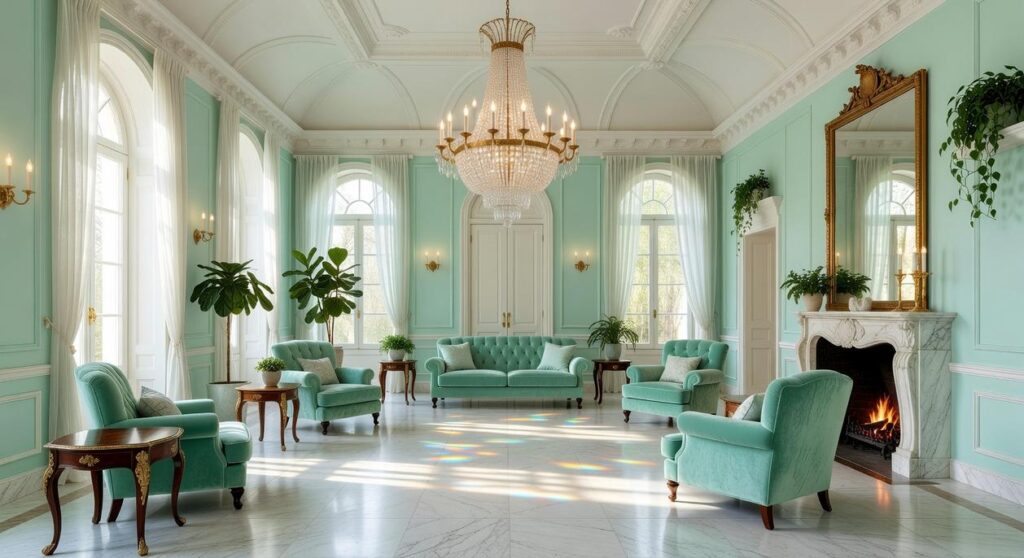
Mint with blue undertones gives you that crisp, airy feel. It’s what you see in old Rococo palaces where light bounces off gilded mirrors. The color feels cool and refreshing (like stepping into a marble foyer on a hot day).
Mint with yellow undertones leans warmer. Softer. It moves closer to celadon territory and wraps a room in gentle comfort instead of cool elegance.
Here’s how to tell the difference. Paint two large samples on your wall. Look at them in morning light, then again at sunset. The blue-based mints stay consistent. The yellow-based ones shift warmer as the day goes on.
Now, some designers say you should always go neutral and add color through accessories. They argue that bold wall colors limit your options down the road.
Fair point. But here’s what they’re missing.
Palatial mint isn’t just a color choice. It’s a mood setter. This hue triggers something in our brains that white walls simply can’t. Studies show that green tones reduce stress and promote calm better than any neutral (which is probably why hospitals actually do use them, just badly).
The real question isn’t whether to use mint. It’s how much.
You’ve got three paths:
- Full immersion where mint covers most walls for that grand, enveloping effect
- Strategic accent with mint on one feature wall while keeping others neutral
- Textile and decor focus where ivory or soft grey walls let mint shine through fabrics and furniture
I typically recommend starting with option two if you’re new to mintpalhouse design. One accent wall gives you the palatial vibe without the commitment of painting your entire space.
Test your samples for at least three days before deciding. Trust me on this one.
The Royal Palette: Complementary Colors for a Grand Design
You’ve got your mint walls ready to go.
Now comes the fun part. Picking colors that make mint look like it belongs in a palace instead of a beach house.
Some designers will tell you mint only works with pastels. That you need to keep everything soft and sweet or it’ll clash. They think bold contrasts ruin the elegance.
But I’ve seen that approach fall flat too many times.
Sure, all pastels can work. But it often ends up looking washed out. Like you were afraid to commit to anything with real presence.
Here’s what I recommend instead.
Gilded Glamour (Mint & Gold)
This is the combination I reach for when someone wants that classic palace feel. Polished brass fixtures and gold leaf details on mirrors and furniture frames create instant warmth. The gold pulls out the richness in mint that people don’t expect. For those seeking a touch of elegance in their gaming environment, incorporating elements inspired by Mintpalhouse can transform any space into a classic palace, where polished brass fixtures and gold accents harmonize beautifully with mint hues.
I saw this done beautifully in a dining room last month. Mint walls with a gold sunburst mirror and brass chandelier. It felt expensive without trying too hard.
Soft Sophistication (Mint & Cream & Blush)
If you want something more romantic, layer mint with ivory and soft blush pink. This works especially well in bedrooms and sitting rooms where you want that ethereal quality.
Use these softer shades in your textiles. Think blush velvet pillows on a cream sofa against mint walls. It’s gentle but not boring.
Dramatic Contrast (Mint & Charcoal)
Want to go modern? Pair mint with deep charcoal or black.
I know it sounds risky. But when you use charcoal on door frames or a statement piece of furniture, the mint suddenly pops in a way it never does with pastels. It’s bold without being loud.
This is my go-to for interior mintpalhouse projects where someone wants palace vibes but hates anything traditional.
Monochromatic Majesty (Layering Greens)
Sometimes the best complement to mint is more green. Just darker.
Layer in sage, olive, or emerald through velvet cushions and drapery. Maybe an emerald area rug. The different shades create depth that a single color can’t match.
This approach feels cohesive and rich. Like the room was designed by someone who actually knew what they were doing (even if you’re figuring it out as you go).
Pick the palette that fits how you actually live. Not what looks good in a magazine spread you’ll never recreate.
A Symphony of Surfaces: Luxurious Materials & Textures
You want a room that feels expensive.
Not just looks expensive. Actually feels like you stepped into a different world when you walk in.
I’m talking about the kind of space where every surface tells a story.
Some designers will tell you that paint and basic furnishings are enough. That you don’t need to go overboard with materials. They say it’s wasteful or impractical.
But here’s what they’re missing.
The materials you choose create the entire mood of a room. A study from the Journal of Interior Design found that tactile elements affect our perception of space quality by up to 60% (more than color alone). Your brain registers texture before it even processes the furniture layout.
Start with your floors. Polished marble with intricate inlays creates instant drama. I’ve seen homeowners install classic dark-stained parquet wood floors and the contrast against light walls is stunning. The dark grounds everything while the walls breathe.
Your walls and ceilings need more than flat paint.
Mint green silk wallpaper or damask patterns add depth you can’t get any other way. But don’t stop there. Ornate plasterwork like crown molding and ceiling medallions turned standard rooms into showpieces in European estates for centuries. There’s a reason that approach still works.
Fabric choice matters more than you think. Heavy silk or velvet draperies control light differently than cotton. Tufted velvet on sofas and headboards invites touch. Crisp linen for secondary seating balances the richness without making everything feel heavy.
For interior advice mintpalhouse principles, hard surfaces seal the deal. Crystal chandeliers refract light in ways that LED fixtures never will. Mother-of-pearl inlays catch the eye with subtle iridescence. White Carrara marble for tabletops and mantels has been the gold standard since Renaissance Italy (and it’s still unmatched for a reason).
Each material works together. That’s how you build a room that doesn’t just look good in photos but actually changes how you feel when you’re in it.
Furnishing the Grand Spaces: Scale, Style, and Silhouette
You can’t just drop regular furniture into a grand room and call it a day.
I learned this the hard way when I first started working with larger spaces. A standard sofa that looked perfect in the showroom? It disappeared completely in a room with 14-foot ceilings. Understanding the nuances of scale in design can be crucial, as I discovered while transforming my space into a cozy yet sophisticated Home Interior Mintpalhouse, where even the largest furnishings need to harmonize with the room’s expansive height.
The truth is, grand spaces need furniture that can hold its own.
Some designers will tell you that mixing small pieces creates visual interest. That you should avoid “heavy” furniture because it makes rooms feel closed in.
Here’s where I disagree.
In palace-style interiors, undersized furniture doesn’t create interest. It creates confusion. Your eye searches for something to anchor on and finds nothing.
Start with a defining style. Louis XV brought us those curved cabriole legs and ornate carvings. Neoclassical gave us clean lines with just enough detail. Art Deco delivered geometric shapes in rich materials.
Pick one and commit to it in your main pieces.
Now let’s talk about scale. According to interior design research from the University of Minnesota, furniture should occupy roughly 60% of floor space in formal rooms to feel balanced (which is higher than the 40-50% recommended for casual spaces).
That means you need pieces with presence.
I’m talking about sofas that stretch 8 to 10 feet. Bergères with backs tall enough to frame whoever sits in them. Dining tables that seat twelve without extensions.
Every room needs one statement piece. In Home Interior Mintpalhouse design, this is your anchor.
A gilded console in your entry sets the tone before guests even remove their coats. A canopied bed transforms a bedroom into a private retreat. A bombé chest with marble top? That’s the kind of piece people remember.
The key is proportion, not just size.
Illuminating the Palace: Lighting as the Crown Jewels
You walk into a room and something just feels right.
Nine times out of ten, it’s the lighting.
Most design guides will tell you to pick a nice chandelier and call it done. But that’s where they stop. They don’t talk about what happens after you hang that centerpiece.
Here’s what I’ve learned from years of working with interior mintpalhouse projects.
A chandelier is your anchor. I won’t lie to you and say you can skip it. You need that grand, multi-tiered crystal piece hanging in the center. It’s your room’s main jewel.
But here’s the part everyone misses.
That chandelier alone? It creates harsh shadows. It makes your space feel like a museum after hours (and not in a good way).
You need layers.
Add gilded or crystal wall sconces. They fill in the gaps and make your architectural details actually visible. That crown molding you paid for? Sconces bring it to life.
Then comes the part most designers ignore completely.
Table lamps with silk shades. Place them where people actually sit. Pair them with uplights positioned in corners or behind plants.
What this does is create pools of warm light. Even a massive room starts to feel intimate. You get depth instead of that flat, one-note glow that screams “I tried but didn’t quite get there.”
The difference between a well-lit palace and a cold showroom? It’s all in those layers.
I get it. You’re staring at this big room and wondering if mint green is too soft to make a statement.
It’s not.
You can create a space that feels both grand and sophisticated with the right approach. The trick is knowing how to balance color with texture and scale.
I’ve seen too many people back away from mint because they think it won’t hold up in a formal setting. They’re wrong.
The secret is in the layers. You need materials that bring weight and richness. Think velvet, brass, marble. Pair your mint with metallics that catch the light and anchor the softness. In the world of interior design for gaming spaces, the enchanting allure of Mintpalhouse is best achieved by layering rich materials like velvet and brass, which harmoniously complement the mint tones and create an inviting atmosphere that enhances the overall experience.
Classical design principles still apply here. Proportion matters. So does restraint.
You came here worried about whether mint could work in a grand space. Now you know it can.
Your Mint Green Reign Begins
Start with your perfect shade. Not all mints are created equal.
Build a mood board with the textures I’ve outlined. Gather fabric swatches, metal samples, and paint chips. See how they work together before you commit.
interior mintpalhouse has the resources you need to refine your vision and find inspiration from real projects.
Your grand space is waiting. The fear of using a soft color in a powerful setting is behind you now.
You have the framework. Time to bring it to life.
 Quenric Drovayne writes the kind of home and garden trends content that people actually send to each other. Not because it's flashy or controversial, but because it's the sort of thing where you read it and immediately think of three people who need to see it. Quenric has a talent for identifying the questions that a lot of people have but haven't quite figured out how to articulate yet — and then answering them properly.
They covers a lot of ground: Home and Garden Trends, DIY Home Projects, Interior Design Ideas, and plenty of adjacent territory that doesn't always get treated with the same seriousness. The consistency across all of it is a certain kind of respect for the reader. Quenric doesn't assume people are stupid, and they doesn't assume they know everything either. They writes for someone who is genuinely trying to figure something out — because that's usually who's actually reading. That assumption shapes everything from how they structures an explanation to how much background they includes before getting to the point.
Beyond the practical stuff, there's something in Quenric's writing that reflects a real investment in the subject — not performed enthusiasm, but the kind of sustained interest that produces insight over time. They has been paying attention to home and garden trends long enough that they notices things a more casual observer would miss. That depth shows up in the work in ways that are hard to fake.
Quenric Drovayne writes the kind of home and garden trends content that people actually send to each other. Not because it's flashy or controversial, but because it's the sort of thing where you read it and immediately think of three people who need to see it. Quenric has a talent for identifying the questions that a lot of people have but haven't quite figured out how to articulate yet — and then answering them properly.
They covers a lot of ground: Home and Garden Trends, DIY Home Projects, Interior Design Ideas, and plenty of adjacent territory that doesn't always get treated with the same seriousness. The consistency across all of it is a certain kind of respect for the reader. Quenric doesn't assume people are stupid, and they doesn't assume they know everything either. They writes for someone who is genuinely trying to figure something out — because that's usually who's actually reading. That assumption shapes everything from how they structures an explanation to how much background they includes before getting to the point.
Beyond the practical stuff, there's something in Quenric's writing that reflects a real investment in the subject — not performed enthusiasm, but the kind of sustained interest that produces insight over time. They has been paying attention to home and garden trends long enough that they notices things a more casual observer would miss. That depth shows up in the work in ways that are hard to fake.