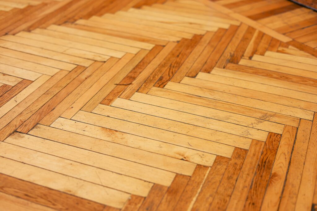
Earth Toned Basics Are Back
Some colors just feel like home. Warm terracottas, muted olives, and sandy beiges are stepping up as the new neutrals low key, versatile, and surprisingly expressive. These aren’t loud shades. They don’t beg for attention. Instead, they ground a space, making it feel steady and lived in. Think desert cliffs, old clay tiles, wild hillside herbs earthy and honest.
Why the shift? People are craving calm. After years of digital overload and design trends that leaned sterile or loud, these tones offer something quieter, more rooted. They work across seasons and styles, adding subtle depth without overtaking the room.
You’ll see them most often in living rooms, open kitchens, and entryways the parts of the home that set the tone. Used well, they fade into the background just enough to make everything else stand out. No fuss, all feeling.
Moody Hues Meet Soft Textures
If you want a small room to punch above its weight, go dark and go plush. Deep plum, charcoal, and midnight blue aren’t just power colors they’re mood setters. Layered with materials like velvet, linen, or matte weave fabrics, these shades bring intimacy and subtle drama without tipping into claustrophobic. It’s a combo that holds the eye and doesn’t shout for attention.
In tight spaces think bedrooms, reading corners, or that bare wall begging for personality depth and texture do the heavy lifting. Flat paint in a bold color can fall short. But pair that same tone with a touchable textile or a soft, diffused light source, and suddenly the room breathes differently. It feels curated. Intentional. Finished.
These colors work best when framed by quiet neutrals or natural materials: a slate throw on a linen bedspread, a tufted armchair in front of a charcoal wall, brass accents to warm things up. Done right, moody doesn’t mean heavy it means considered.
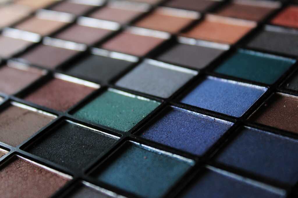
Soft Pastels Are Growing Up
Pastel shades are no longer just for nurseries or spring themed palettes. In 2024, they’re evolving into sophisticated, grown up options that add quiet personality to modern homes.
Subtle Yet Statement Worthy
Instead of high contrast color play, this trend leans into softness. Think delicate tones that capture light and bring subtle emotion without overwhelming a space:
Dusty peach for soft warmth
Mauve for a romantic, muted elegance
Sage green for a calm, natural touch
These colors work beautifully as full wall applications, creating cozy backdrops that still feel fresh and modern.
Why They Work
Soft pastels are ideal when you want to introduce color without visual clutter. They:
Lighten and open up smaller rooms
Add character without stealing focus
Pair well with a variety of textures and furnishings
Best Style Pairings
For those wondering how to blend pastels into their decor, look to tried and true design approaches:
Vintage interiors: Pastels echo retro palettes, enhancing charm without kitsch
Scandinavian style: Clean lines and natural textures balance pastel hues for a modern, livable look
Whether you’re updating a guest room or adding some serenity to your home office, grown up pastels offer an easy path to gentle, stylish color.
Color Blocking with Confidence
Go bold or go home. Color blocking isn’t subtle it’s built to stand out. Think vivid combos like mustard and navy, or teal punched up with coral. These high contrast palettes can wake up a space fast, but using them well takes some control.
Keep your base simple. Start with a neutral floor or ceiling to ground the room. Use color in segments a painted lower wall, a geometric mural, or a block of contrasting cabinetry. Stick to two or three tones max to avoid visual chaos. And adjust for light: high contrast colors absorb more, so the room might feel smaller if you go all in.
This style thrives in areas where energy matters: kids’ rooms, creative corners, or that one wall you’ve never figured out what to do with. When done right, it’s artful without trying too hard and a lot more fun than beige.
The Green Wave Continues
Green isn’t just a trend it’s a mindset. Saturated emeralds and dulled eucalyptus tones are sticking around, not just for their aesthetic value, but for the emotional tone they set: calm, clean, and quietly invigorating. These shades bring the outside in without trying too hard, a direct nod to biophilic design principles.
Paired with raw wood, weathered stone, or woven textures, these greens gain depth and purpose. It’s not about creating the illusion of nature it’s about channeling its rhythm. Use them as statement walls, cabinetry finishes, or soft upholstery accents. They ground a room without making it feel heavy.
Explore how these greens and their smart pairings can redefine your space in color trends this year.
High Impact Neutrals
Black has transitioned from statement to staple. In today’s homes, it’s not about rebellion or edge it’s about control, clarity, and contrast. Think matte black light fixtures, cabinetry accents, or framing on glass doors. Not loud, just deliberate.
Paired with whites that lean warm creams, ivory, and greige you get a palette that works in any room and with nearly any material. These aren’t the cold, sterile neutrals of the early minimalist wave. They’re warmer, more flexible, more human.
This combo is best suited with clean lines and furniture that doesn’t shout for attention. It’s for people who want their spaces to breathe. Less clutter, more focus. The end result: rooms that feel intentional, quiet, and grown up.
Want more ways to layer in these shades? (Explore more ideas in color trends this year)
Quick Notes Before You Paint
Before you dive into gallons of paint and bold commitments, start small. A test swatch in different lighting (natural AM, harsh PM, and whatever bulb wattage you’re living under) will save you regret later. Wall colors don’t exist in a vacuum light changes everything.
Next, think in layers. Color is the headline, but texture and materials are the fine print. That moody gray might fall flat unless it’s paired with something tactile linen curtains, a matte ceramic lamp, or a raw wood shelf. Every layer adds weight and warmth.
Finally, don’t copy paste whatever trend’s heating up on your feed. Adapt it. What looks fresh in a Brooklyn loft might feel out of place in a sunlit bungalow. Use the trends as a jump off point not a rulebook.
 Ask Susana Foleyesters how they got into outdoor living tips and you'll probably get a longer answer than you expected. The short version: Susana started doing it, got genuinely hooked, and at some point realized they had accumulated enough hard-won knowledge that it would be a waste not to share it. So they started writing.
What makes Susana worth reading is that they skips the obvious stuff. Nobody needs another surface-level take on Outdoor Living Tips, DIY Home Projects, Home and Garden Trends. What readers actually want is the nuance — the part that only becomes clear after you've made a few mistakes and figured out why. That's the territory Susana operates in. The writing is direct, occasionally blunt, and always built around what's actually true rather than what sounds good in an article. They has little patience for filler, which means they's pieces tend to be denser with real information than the average post on the same subject.
Susana doesn't write to impress anyone. They writes because they has things to say that they genuinely thinks people should hear. That motivation — basic as it sounds — produces something noticeably different from content written for clicks or word count. Readers pick up on it. The comments on Susana's work tend to reflect that.
Ask Susana Foleyesters how they got into outdoor living tips and you'll probably get a longer answer than you expected. The short version: Susana started doing it, got genuinely hooked, and at some point realized they had accumulated enough hard-won knowledge that it would be a waste not to share it. So they started writing.
What makes Susana worth reading is that they skips the obvious stuff. Nobody needs another surface-level take on Outdoor Living Tips, DIY Home Projects, Home and Garden Trends. What readers actually want is the nuance — the part that only becomes clear after you've made a few mistakes and figured out why. That's the territory Susana operates in. The writing is direct, occasionally blunt, and always built around what's actually true rather than what sounds good in an article. They has little patience for filler, which means they's pieces tend to be denser with real information than the average post on the same subject.
Susana doesn't write to impress anyone. They writes because they has things to say that they genuinely thinks people should hear. That motivation — basic as it sounds — produces something noticeably different from content written for clicks or word count. Readers pick up on it. The comments on Susana's work tend to reflect that.